Redesigning Telecom Network Firewall Platform
Redesigning Telecom Network Firewall Platform
Services
UX Research
User & Workflow Design
Wireframing & Prototyping
UI & Visual Design
Iterative Design & Validation
Collaboration & Handoff
Agile & Sprint Management
Deliverables
User Personas
User Journey Maps
Navigation Structures
Low-Fidelity Sketches
High-Fidelity Wireframes
High-Fidelity Prototypes
Project Slide Presentations
Design Specifications
Feature Descriptions
Testing scripts
Product Demo
Outcomes
35% faster to find specific rules with the new navigation
50% less clicks needed during usual TIU browsing
60% increase in User Satisfaction
CONTEXT
Introduction
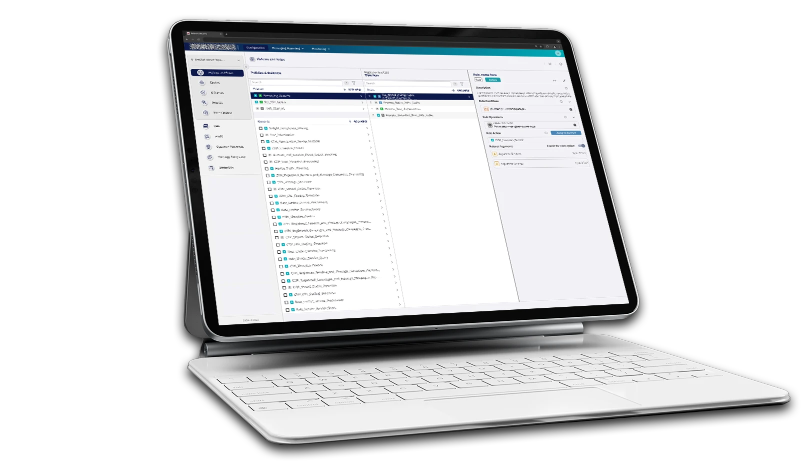
Protecting 1.8 Billion People with Enterprise-Grade Network Security.
The Network Protection Platform is built upon robust enterprise technologies, including Kubernetes and Red Hat OpenShift, ensuring scalability, security, and efficient orchestration. This high-performance architecture enables real-time threat detection and the implementation of flexible, automated policies. Through its clients, processing about 1.5 trillion messages annually.
Clients that uses one or more solutions
FIRST STEPS
Objective setting
Objective 1:
Streamline the user interface for the Threat Intelligence Unit (TIU) to handle security tasks more efficiently.
Measure of Success:
Increase in the volume of tasks completed per analyst per day, by reducing friction and improving flows.
Objective 2:
Enhance overall platform usability to reduce client support requests and boost engagement in sales and presales.
Measure of Success:
Reduction in client-reported support tickets and increase demo engagement.
User groups
TIU (Threat Intelligence Unit)
The TIU is an internal team—also the largest user group—often hired by clients to operate the system and protect their networks.
Engineering department
Our developers also use the system to create improvements and updates. This group is highly skilled and deeply technical.
Client’s team
Not all clients have their own dedicated team; those that do typically have just a few people managing the system.
ANALYSIS
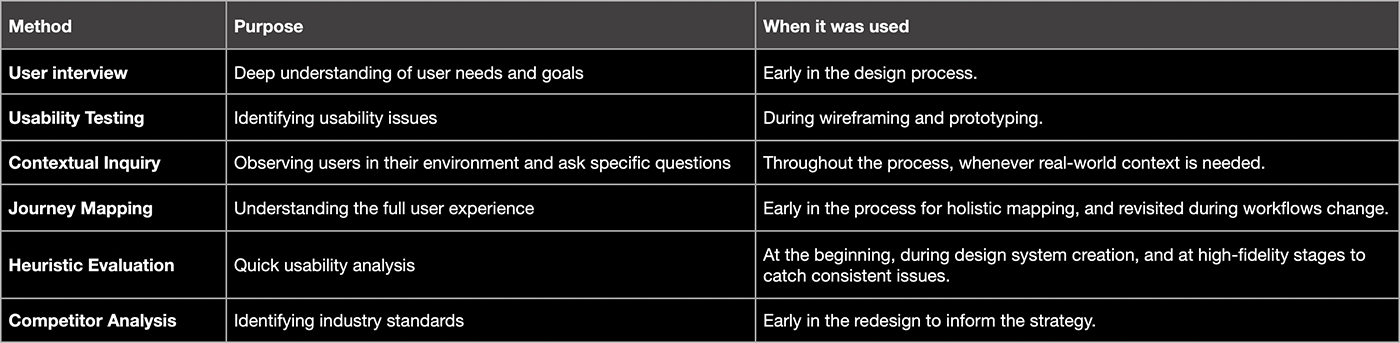
Heuristic Evaluation
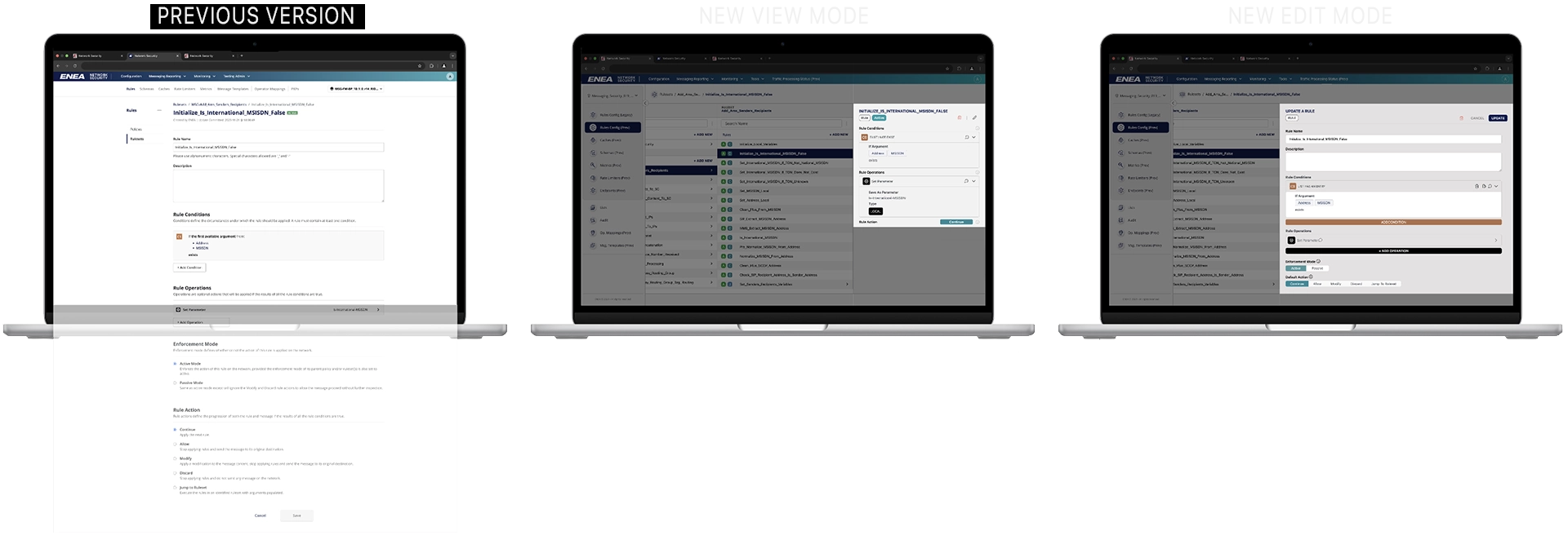
I began by auditing the existing system to fully grasp its functionality, workflows, and user journeys. Using heuristic evaluations and journey mapping, I identified the most critical improvement areas and prioritized where to start.

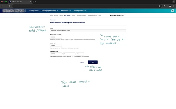
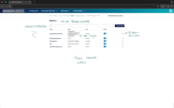
Annotated view of the original platform, highlighting key usability issues discovered during initial research.
Although the old UI appears clean and visually appealing, it fails to provide essential information, and often shows truncated text due to space limitations. While it may look good at a glance, actual users quickly realize that clarity and usability were sacrificed for aesthetics.
User Interviews & Constraints
- Participants: Engaged key stakeholders, including the VP of Engineering, Director of Engineering, Lead Architect, Program Manager, Head of TIU, TIU Manager, and engineering developers, to gather diverse perspectives.
- Security Restrictions: Strict security protocols prevented the use of recording or tracking tools to be added into the system.
- Qualitative Focus: Due to a limited user base, conducted in-depth qualitative research and leveraged internal expertise to simulate user scenarios, ensuring comprehensive insights.
Findings:
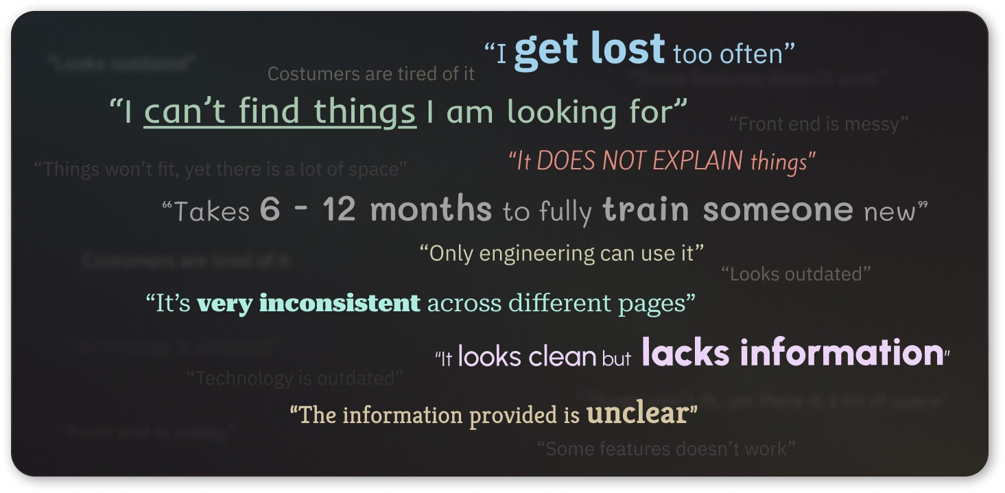
Analysis:
The interface is difficult to navigate, inconsistent, and lacks clarity, leading to high training time and frustration.
Recommendation:
Redesign with a focus on clear navigation, consistent layouts, and better information hierarchy to improve usability and reduce onboarding time.
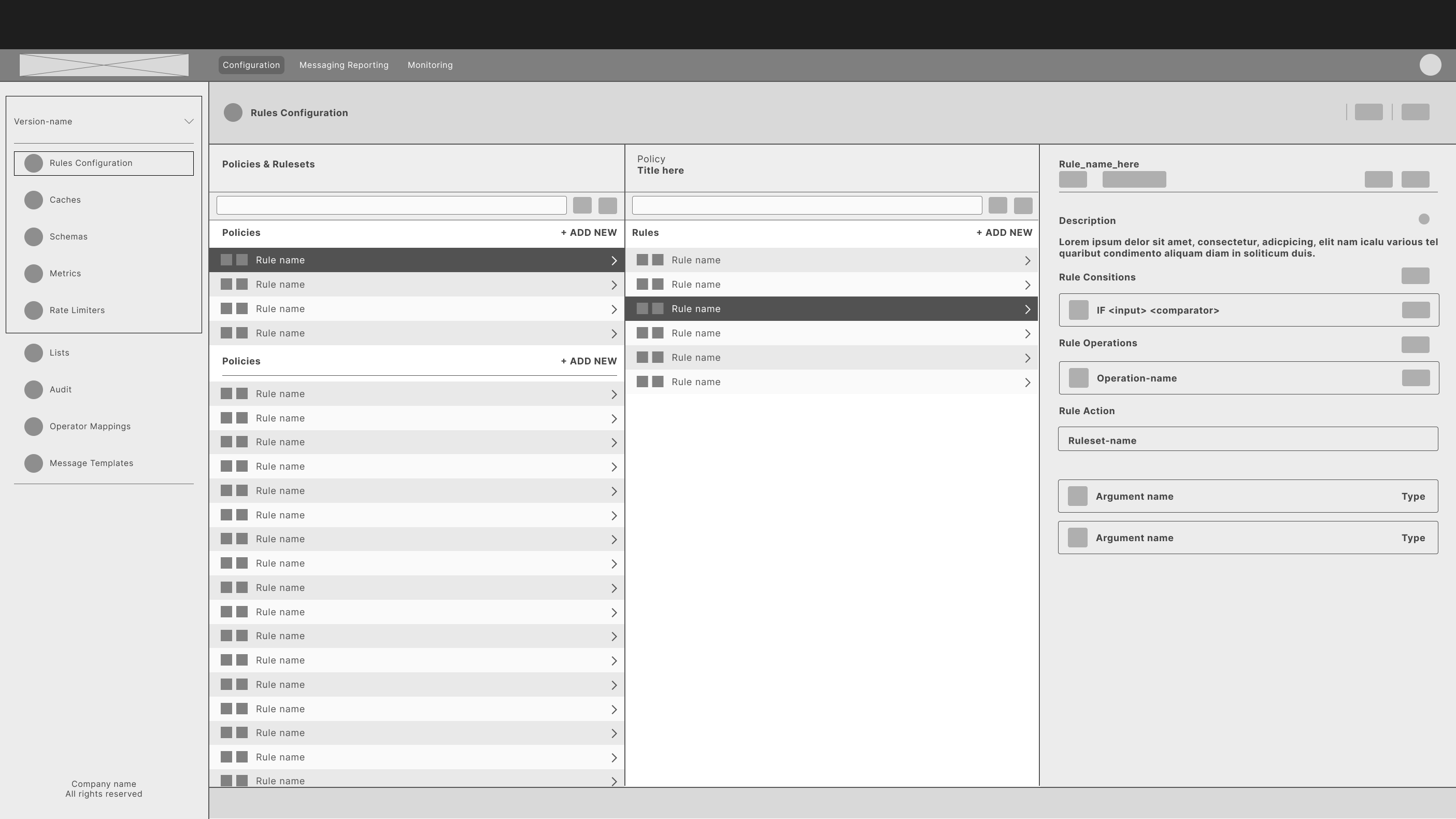
Navigation:
Using something simple and familiar has helped users with the learning curve. The new structure alone has improved the perception and understanding of the Rules Workflow — User feedbacks were important during the implementation phase.
Reducing clutter & and providing better navigability
Removing unnecessary information and introducing view mode allowed the UI to be straightforward and less overwhelming to users, while proving better experiences for other user roles.
By consolidating key information, the new UI reduces scrolling and maximises clarity—making the it more efficient and user-friendly.
Accessibility:
This project didn’t require full WCAG compliance, but we ensured that key accessibility features were implemented.
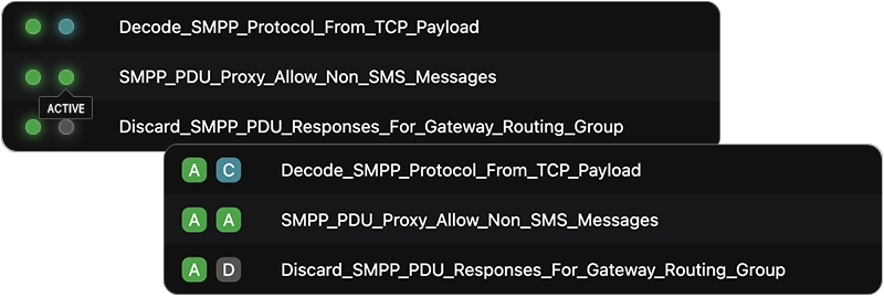
Example of badges enhanced with letters and color—not color alone—to improve accessibility.
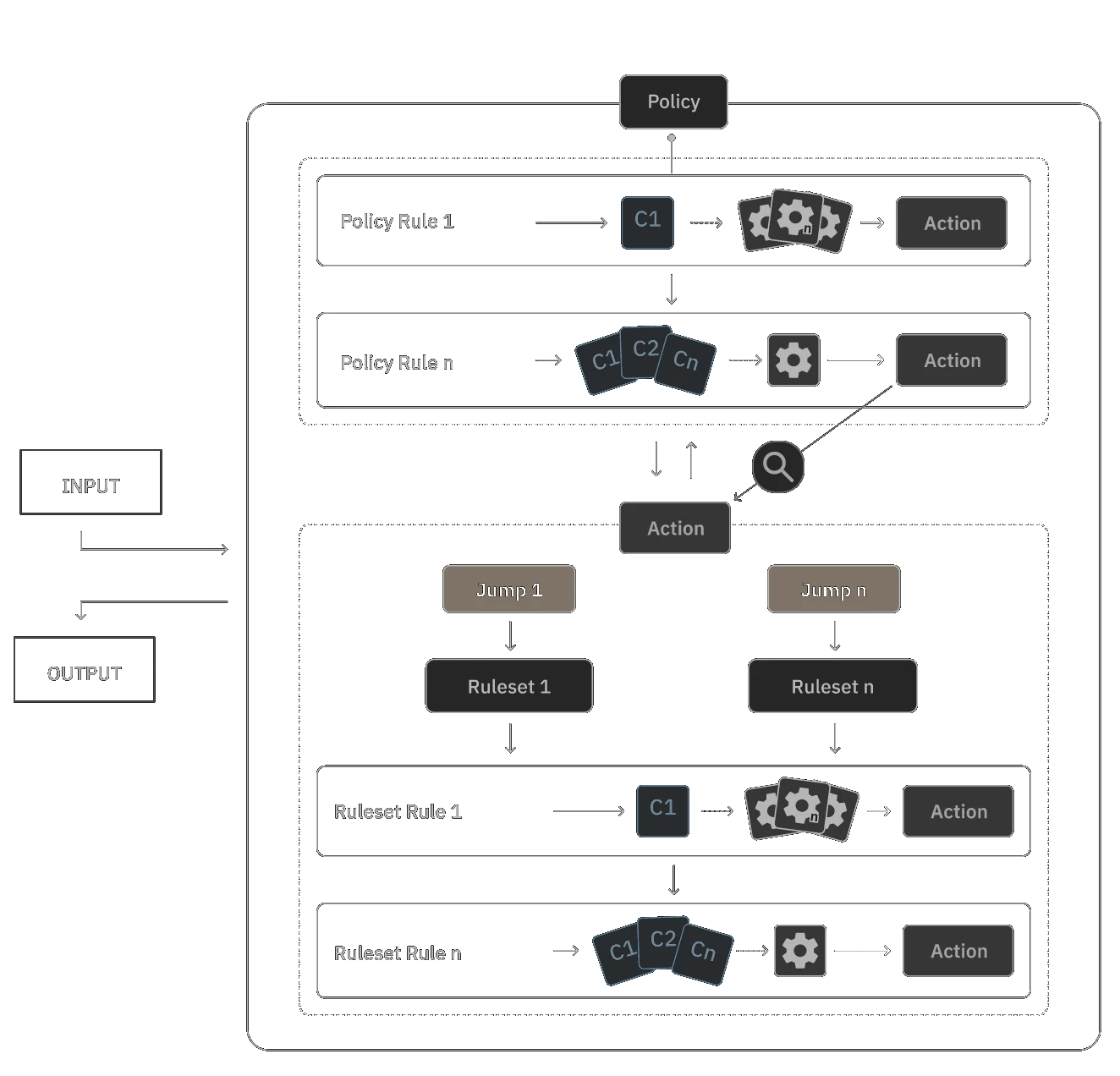
Micro-Journey Mapping and Cross-Functional collaboration:
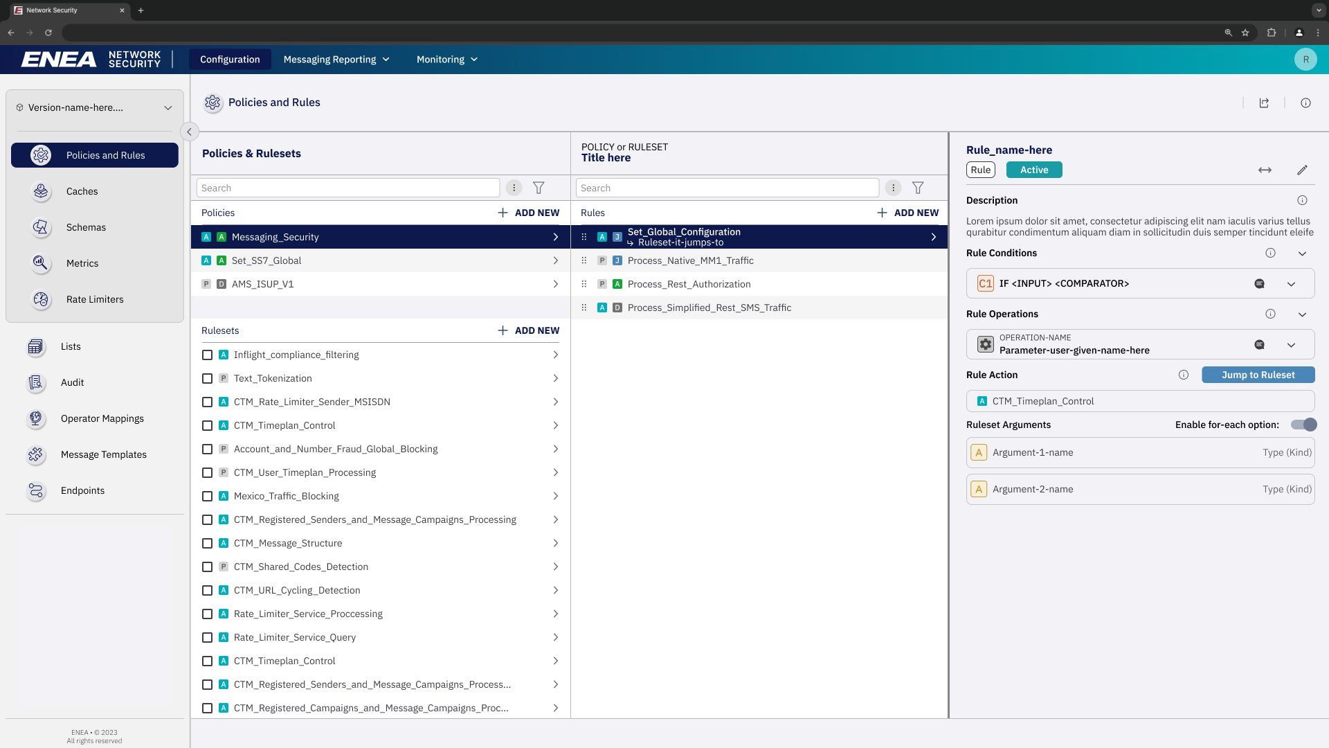
Condition Builder:
During the rule creation process, users were required to set conditions and operations. Initially, the condition builder was designed to be highly flexible, but usability testing revealed that this approach caused confusion and overwhelmed users. Collaborating with developers and experienced users, I discovered that most conditions created were of similar types. To address this, I introduced an initial step offering predefined condition types, along with an ‘Advanced’ option to retain flexibility for power users:
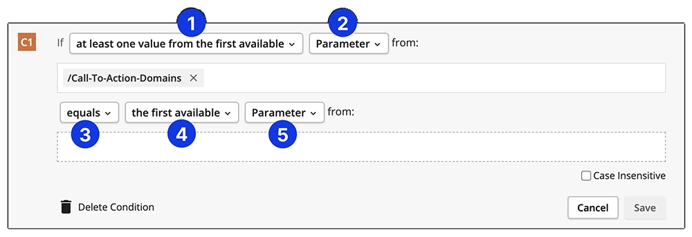
Initial Condition Building Flow: The initial design presented users with a broad range of options at each step in a cascading flow. While this approach offered flexibility, it often overwhelmed users.
Iterated Condition Building Flow: Introduced an initial step presenting commonly used condition types, along with an ‘Advanced’ option for power users.
Operation Builder:
The initial design required numerous clicks, making it difficult for users to understand their selections. Users struggled to identify the appropriate options. To improve this, we enhanced the workflow by providing more information upfront and rewriting descriptions for all operations. Collaborating with cross-functional teams, including writers and developers, we removed technical terms and adopted a consistent format to enhance clarity.
Original Flow: Users had to perform multiple clicks to read descriptions, leading to confusion in selecting appropriate options.
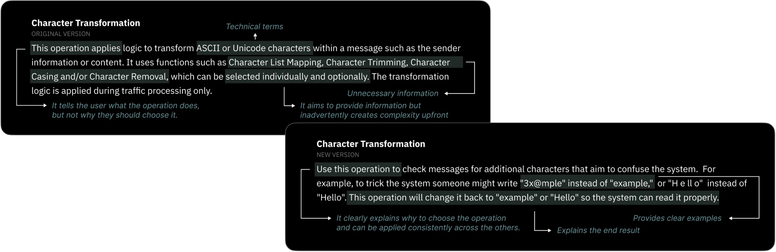
To enhance user understanding, we rewrote the tooltips for all 80 rule operations. Each tooltip now follows a consistent format that explains the purpose of the operation, avoids technical jargon, and provides a clear example.
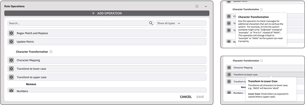
Iterated Operation Building Flow: Introduced tooltips at the initial step, providing information without requiring any clicks. Collaborated with cross-functional teams to develop new copy using appropriate language.
Usability Testing Results:
To evaluate the effectiveness of those changes, I had the opportunity to conduct a small usability test comparing the time taken by our interns and TIU experts to create a rule involving Conditions and Operations.
Initial Testing:
- Participants: 5 interns and 3 TIU experts.
- Findings:
- Interns required 4 to 5 days to complete the task.
- TIU experts completed the task in 2 to 4 hours.
Post-Redesign Testing:
- Participants: Same groups as initial testing.
- Findings:
- Interns reduced their completion time to 1 to 2 days.
- TIU experts accomplished the task within 1 hour.
These results indicate a significant improvement in user efficiency following the redesign, benefiting both novice and experienced users.
Prioritisation:
With a tight timeline and many valuable features in the pipeline, we used a must-have/should-have/could-have/won’t-have prioritization approach. By focusing on essential functionality first and collaborating closely with stakeholders and developers, we delivered a successful on-time launch. While some users missed deferred features, transparent communication about our roadmap preserved trust and anticipation for future updates.
Operational management:
In my capacity as the Directly Responsible Individual (DRI) for this project, I ensured its successful completion by:
- Managing Tasks:
- Ensured creation and updates for tasks in Jira to maintain accurate project tracking.
- Leading Daily Stand-ups:
- Facilitated daily stand-up meetings with both Front-End and Back-End teams, adhering to Agile methodology, to synchronize efforts and promptly address any impediments.
- Stakeholder Communication:
- Regularly communicated with stakeholders to align project progress with expectations, ensuring transparency and obtaining necessary feedback.
- Presenting Design and Implementation:
- Delivered presentations that articulated design and implementation progress from the user’s perspective, clarifying changes for all involved parties.
Results:
35%
Faster to find specific rules with the new navigation
50%
Less clicks needed during usual TIU browsing
60%
Increase in User Satisfaction
Objective 1: The revamped navigation and optimised screen layout enabled TIU to complete tasks much faster by allowing users to view more information at once and reduce clicks and scrolling.
Objective 2: So far, team is observing about 20% less incoming tickets and Sales already reported that the new UI are helped closing a major US deal at the end of 2024.
Disclaimer: The number of clicks were measured by running a ‘before-and-after’ test with a small group of our power users, observing how many steps they took to complete the same tasks on the old versus new interface. For the User Satisfaction figure, I ran a quick post-task ratings (1–5) and open-ended feedback sessions to capture their sentiments, which indicated a substantial jump—from an average of around 2.5 to 4.